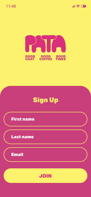
Project concept brief
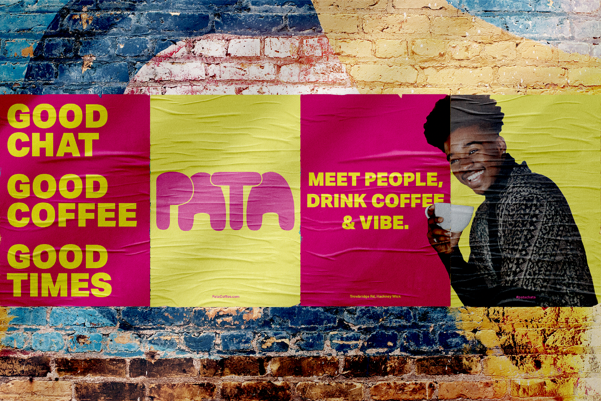
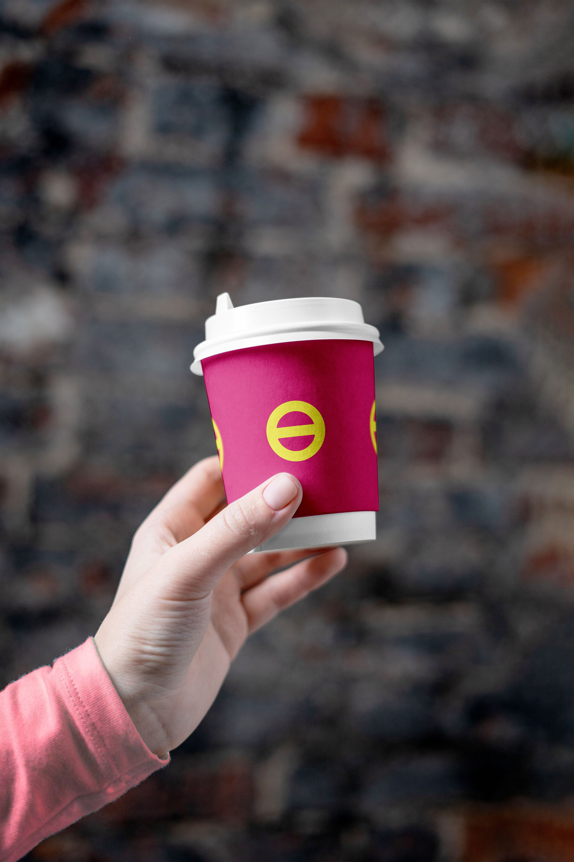
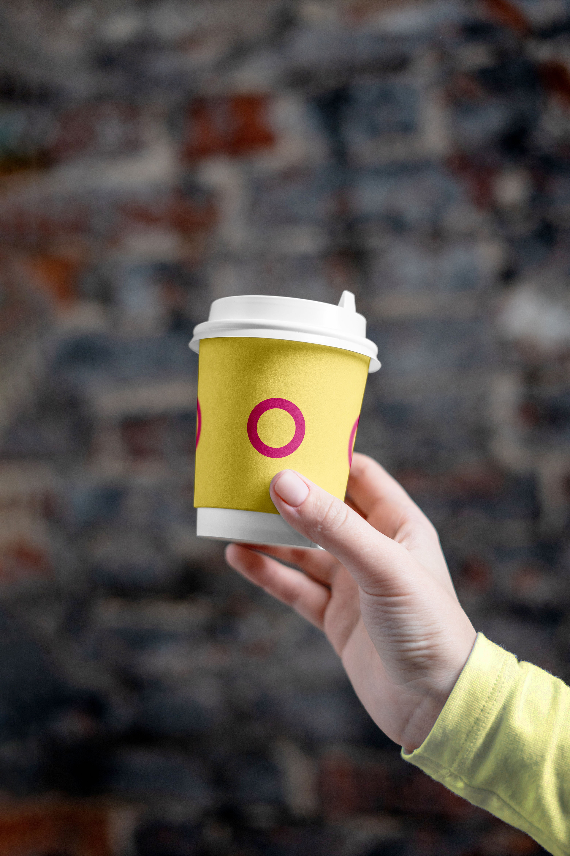
Pata is a coffee shop in Hackney Wick that introduces colour-coded cups to reimagine the coffee shop experience. Pata aims to create a vibrant space where customers can connect. Yellow cups are for those open to conversation and pink cups are for those seeking a more private experience.
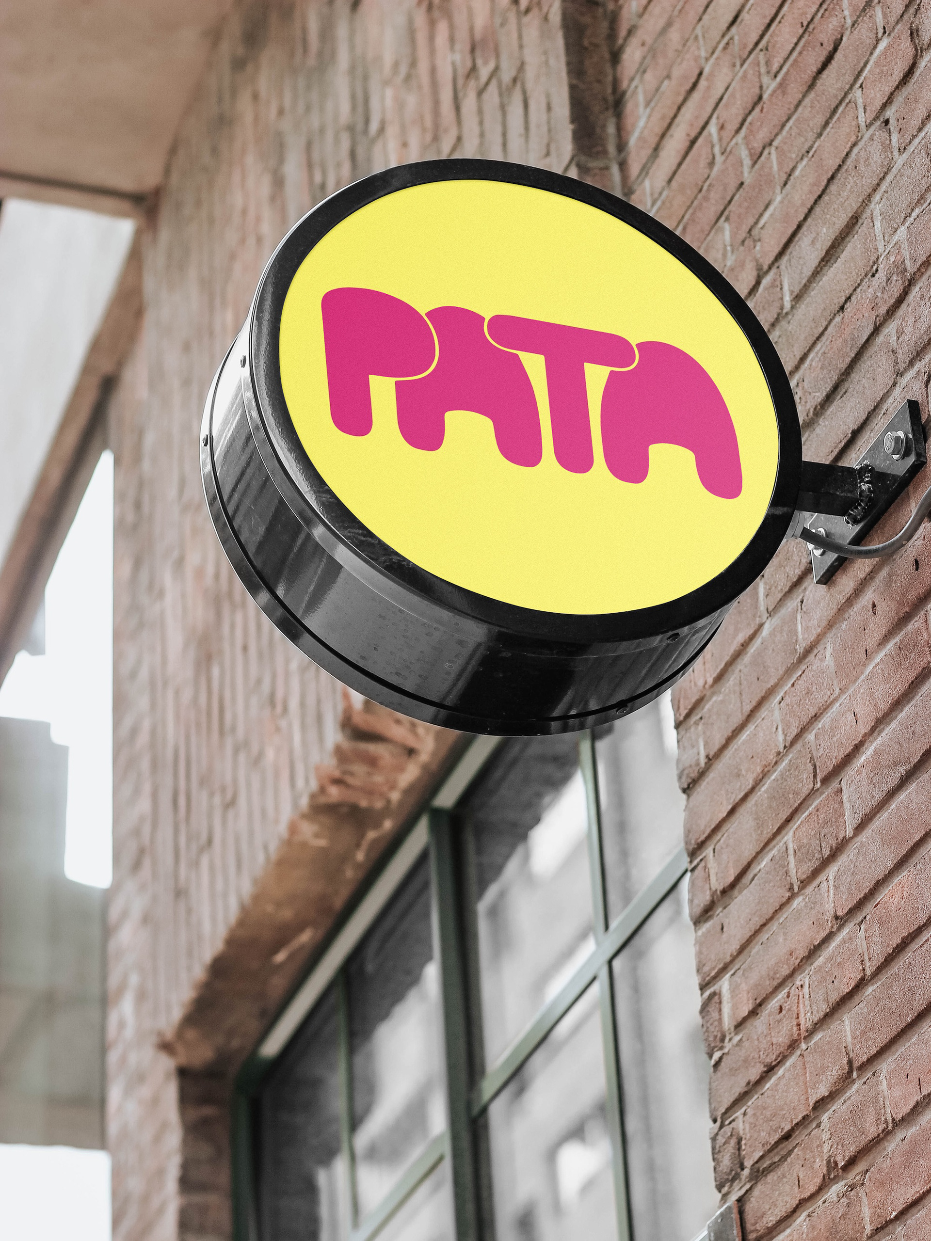
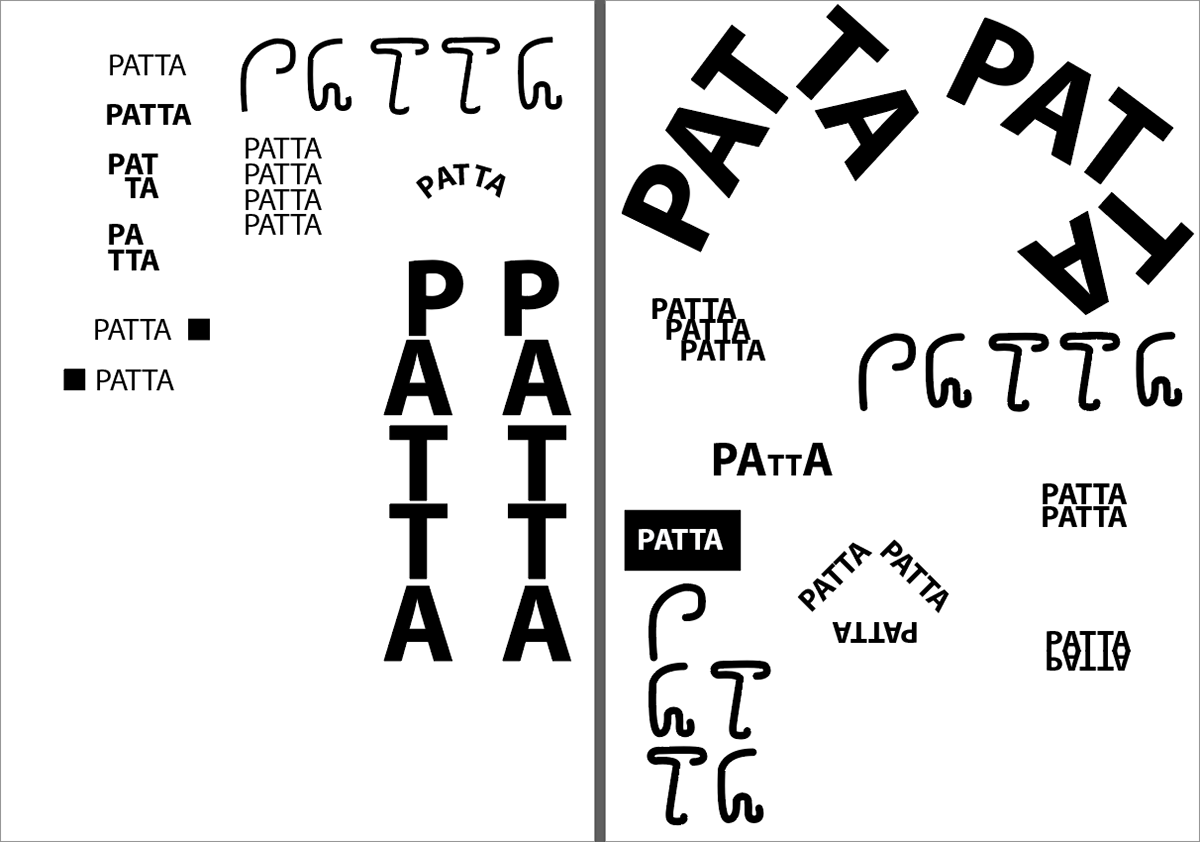
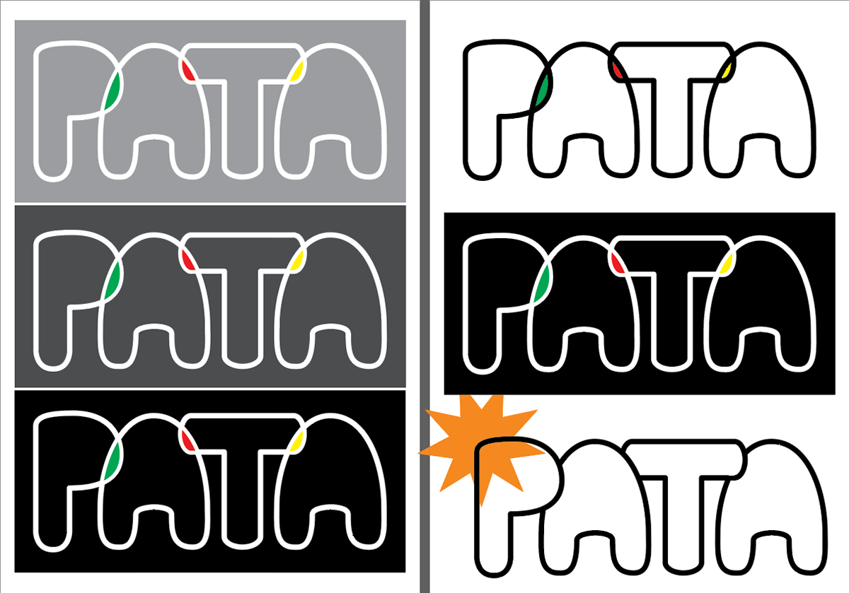
Logo creation
'Patter' the sounds of continuous talk and the rhythmic drip of coffee. Bold and vibrant.
Advertisement
4 poster spreads that catch the eyes with vibrancy and boldness. It is aimed at commuters arriving out of Shoreditch High Street station.
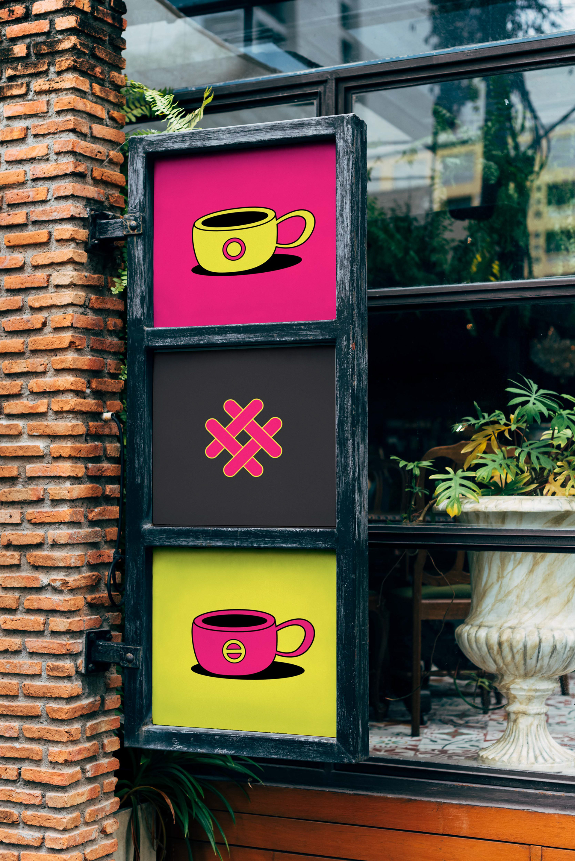
Coffee cups
Pink for privacy and yellow for conversation.
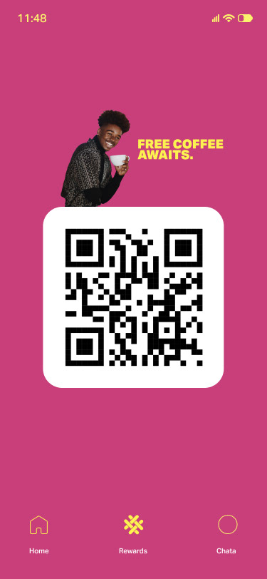
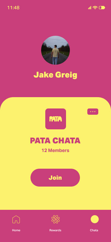
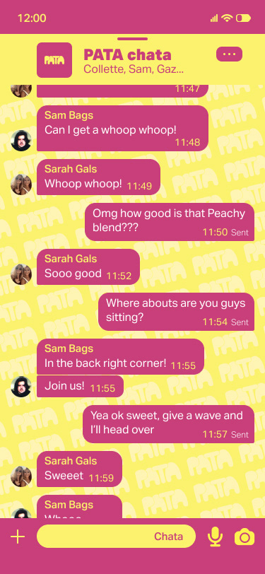
The Pata App
It is used for loyalty cards, keeping with the latest coffee blends and joining Pata chats 'Chatas' to chat with other customers in-house. Data collection will be utilised for promotions.
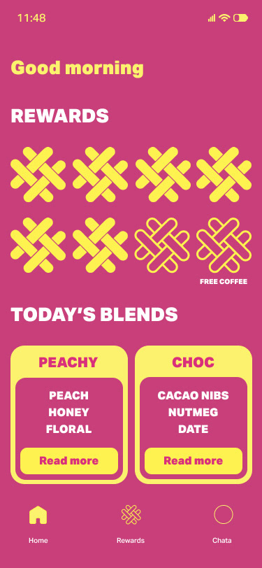
The Pata chatas'
When connected to the wifi, customers can interact with others in the same chata.
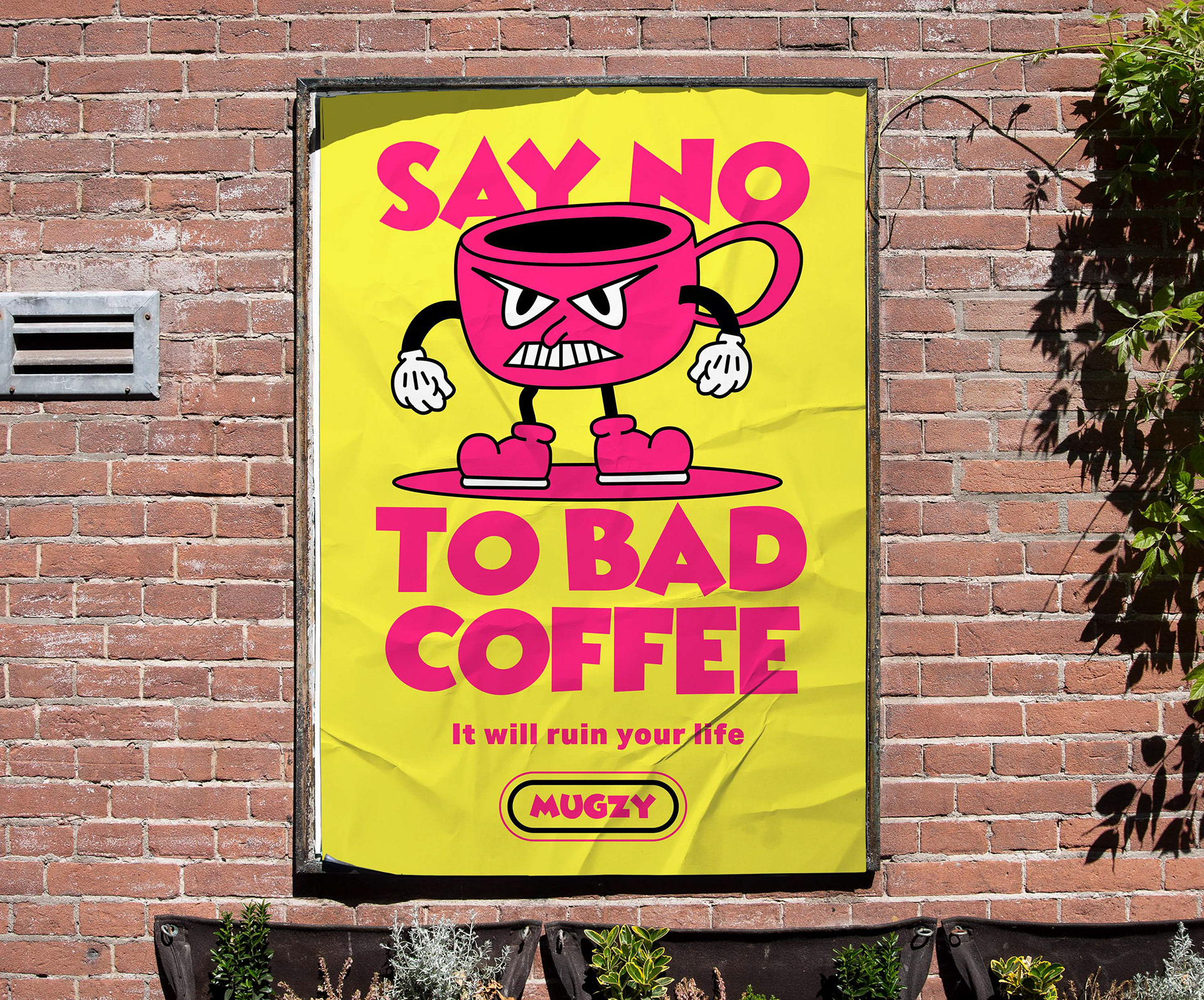
Pata posters
Placed in the outdoor seating area. This is Mugzy. He hates bad coffee.